Splitwise

Splitwise

Splitwise

Redefining Expense Management

Redefining Expense Management

Role & Resources

Role & Resources

Role & Resources

Within the UX/UI bootcamp of Memorisely, we were responsible for guiding the creative process and delivering an awe-inspiring solution. The adventure spanned a thrilling 10-week period, where we embarked on a quest to conquer challenges and create the ultimate user experience. With a spritz of intuition and a dash of playfulness, we wielded state-of-the-art tools like the ones below

Within the UX/UI bootcamp of Memorisely, we were responsible for guiding the creative process and delivering an awe-inspiring solution. The adventure spanned a thrilling 10-week period, where we embarked on a quest to conquer challenges and create the ultimate user experience. With a spritz of intuition and a dash of playfulness, we wielded state-of-the-art tools like the ones below

Role

Role

Role

User Research

User Research

Product Strategy

Product Strategy

UI Design

UI Design

Interaction Design

Interaction Design

Usability Testing

Usability Testing

Tools

Tools

Tools

FigJam

FigJam

Notion

Notion

Figma

Figma

Maze

Maze

Otter

Otter

Team

Team

Team

Tina Schuler

Tina Schuler

Joana Ribeiro

Joana Ribeiro

Notion

Figma

Maze

Otter

Timeline

Timeline

Timeline

10 Weeks

10 Weeks

Notion

Figma

Maze

Otter

Houston, We Have A Problem… And A Solution!

Houston, We Have A Problem… And A Solution!

Houston, We Have A Problem… And A Solution!

The Main Problem

Keeping track of shared expenses can be a messy and confusing process, often leading to misunderstandings and wasted time. Our goal is to enhance the user experience in categorising expenses and tracking payments in Splitwise to increase adoption of the paid product. By implementing intuitive and transparent features that accurately reflect who has paid for what, we aim to foster trust and accountability among users, leading to higher conversion rates and sustained growth for the business.

The Solution

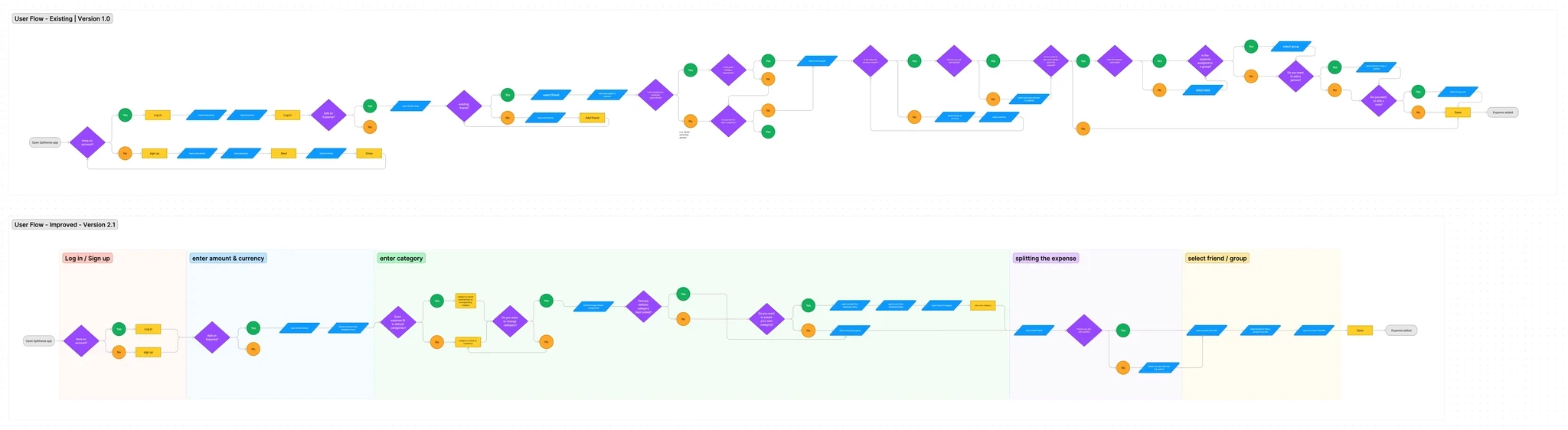
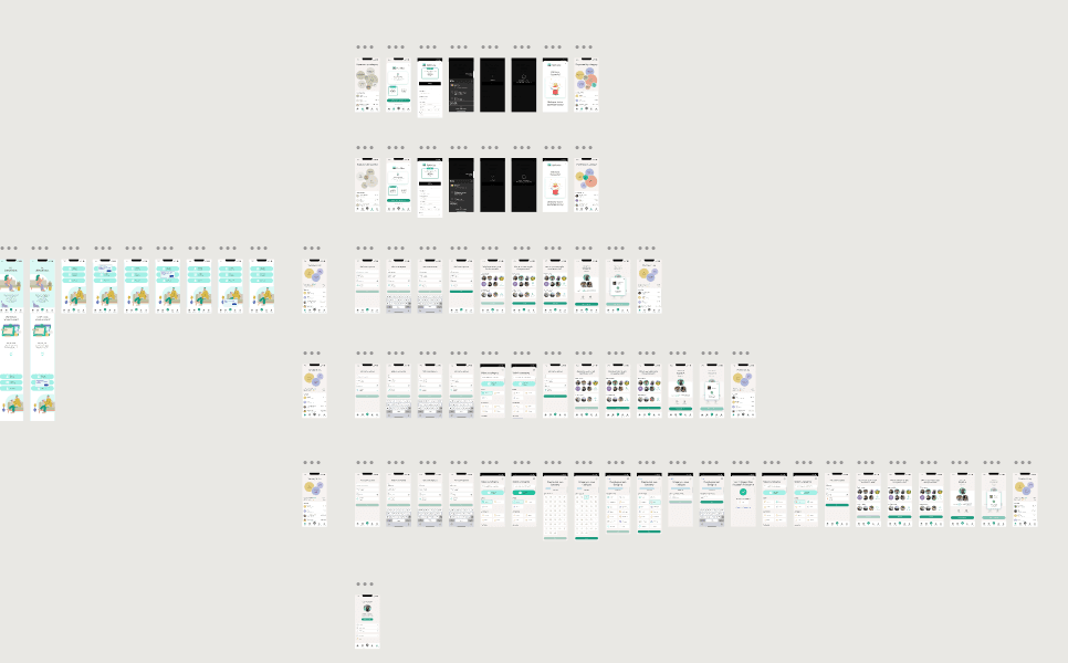
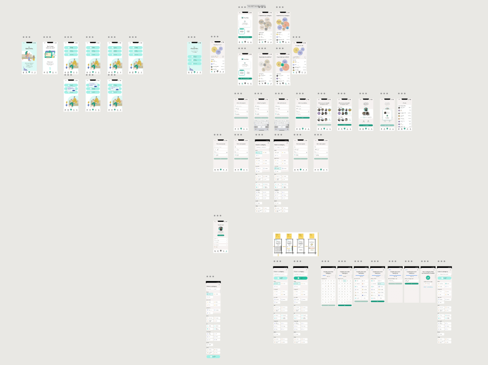
We decided the best improvement would be in simplifying the User Journey, and making the categorisation easier to implement and understand at first glance - making it more intuitive and user friendly.

Business & User Frustrations

Usability Review in Action

Usability Review in Action

Usability Review in Action

The starting point of our research was conducting a usability review using wireframe flows for the complete Splitwise app, so we could identify any further weaknesses we could improve, spending special attention to the Category creation functionality and the flow the users experience every day.

The starting point of our research was conducting a usability review using wireframe flows for the complete Splitwise app, so we could identify any further weaknesses we could improve, spending special attention to the Category creation functionality and the flow the users experience every day.

This allowed us to assess the current user experience and gain a better understanding of any challenges users may have had while using the app.
To complement this, we also focused on the architecture of the Information established in the app, to ensure we didn't leave any gaps in our research

This allowed us to assess the current user experience and gain a better understanding of any challenges users may have had while using the app.
To complement this, we also focused on the architecture of the Information established in the app, to ensure we didn't leave any gaps in our research

Review Snapshot
Review Snapshot

Information Architecture

Information Architecture

Imagine owning a vast collection of books numbering in the thousands. To help people find their preferred books, you create a system to organize them based on genre, author, and topic. This organizing principle is referred to as the library's “information architecture.” It sets up a structure and order for the data, letting users seamlessly navigate and discover their sought-after items.

Imagine owning a vast collection of books numbering in the thousands. To help people find their preferred books, you create a system to organize them based on genre, author, and topic. This organizing principle is referred to as the library's “information architecture.” It sets up a structure and order for the data, letting users seamlessly navigate and discover their sought-after items.

Competitor Benchmarking

Within the context of Splitwise, information architecture relates to how the app's information is arranged and displayed for users. It involves creating a clear layout for the app's features, menus, and choices, ensuring that users can effortlessly understand and access the required information. It's comparable to designing a map or blueprint for the app, making it user-friendly and intuitive.

Competitor Benchmarking

Competitor Benchmarking

Competitor Benchmarking

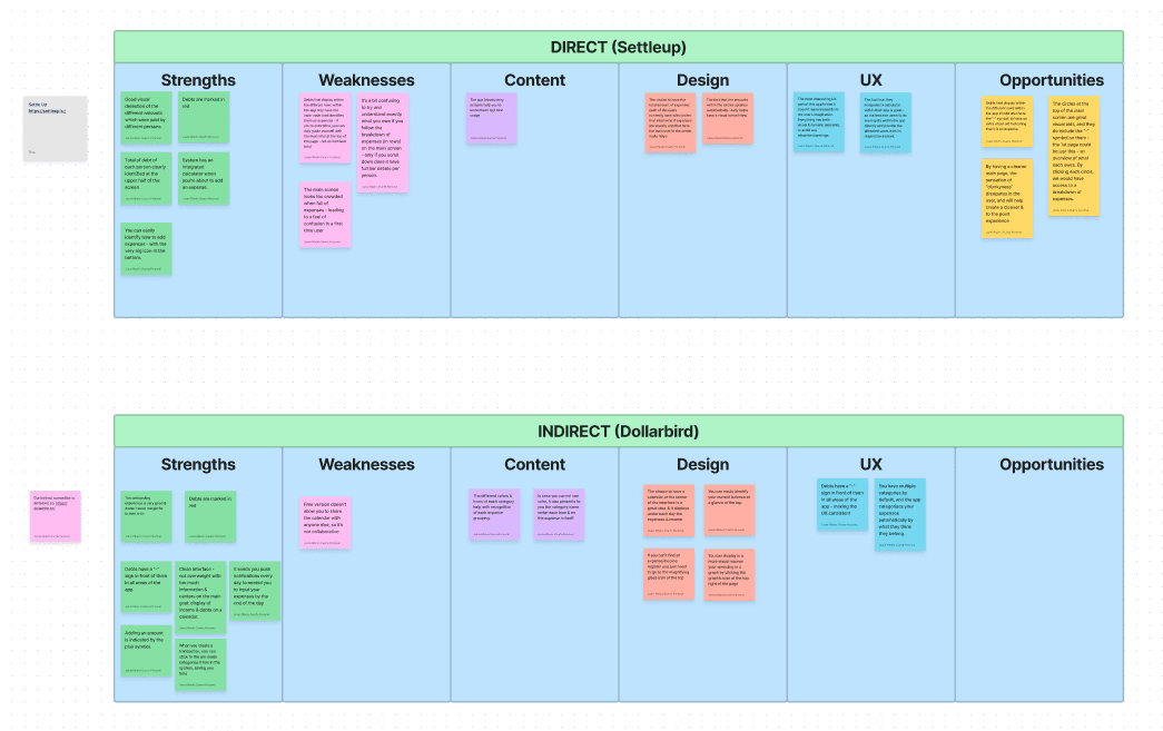
By diving into the wild world of our rivals – both the obvious ones and the sneaky ones lurking in the shadows – we get a peek at what makes our product stand out (or not!). It's like a game of spot-the-difference, but for apps!

Our Splitwise users have been having their fair share of ups and downs, and businesses, well, they've got their own set of gripes too.

People want to add expenses without pulling their hair out, and sorting through the money mess? Don't even get us started! Our superhero mission? To be the beacon of inspiration that guides our users out of the frustrating labyrinth of expense chaos.

Review Snapshot
Review Snapshot
Competitor Benchmarking

Benchmark Findings

Benchmark Findings

Cost

Cost

Cost

Moderate

Moderate

Ease of Use

Ease of Use

Ease of Use

Improvement needed

Improvement needed

Features

Features

Features

Refreshing

Refreshing

UX Design

UX Design

UX Design

Upgrade Required

Upgrade Required

Ready, Set… Go!

Ready, Set… Go!

Ready, Set… Go!

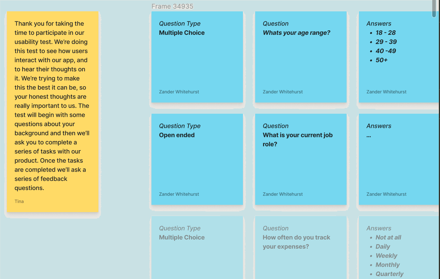
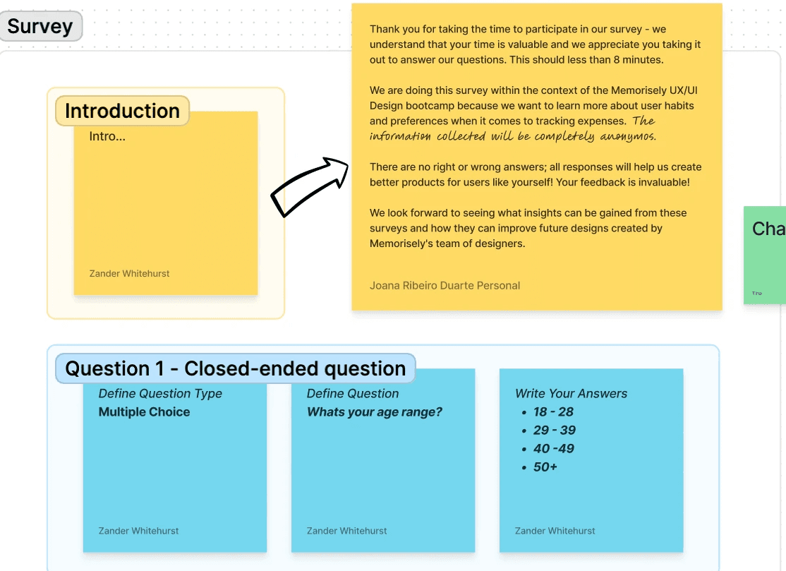
We had plenty of research methods at our disposal, but we chose to start our journey into Splitwise transformation with a Survey, to be able to have as many deep insights as possible into the needs and struggles of our users, and to find how best to help them.

We specifically went with the option of using qualitative surveys, given that they offer the advantage of capturing in-depth insights, adapting to user responses, embracing natural language, understanding context, facilitating iterative design, and establishing a human connection. By leveraging these benefits, we can gather valuable user data that informs our design decisions and ultimately leads to more user-centered and successful products.

Survey Questions

Survey Questions

In developing qualitative survey questions for the Splitwise app, we initiated the process by setting clear research objectives and defining the target audience to align the questions with our specific goals. Extensive background research on user behaviors and pain points within the app informed the creation of open-ended questions, ensuring they encouraged comprehensive responses, like "What specific challenges do you face when using Splitwise for expense management?" Throughout this process, we maintained a focus on question clarity, neutrality, and avoidance of leading language. To refine the questions, we conducted a pilot test with a small group of users, enabling us to fine-tune question wording and identify potential issues. Finally, we deployed the survey to a representative sample of Splitwise users and personally analyzed the qualitative data collected to extract actionable insights for enhancing the app's user experience.

In developing qualitative survey questions for the Splitwise app, we initiated the process by setting clear research objectives and defining the target audience to align the questions with our specific goals. Extensive background research on user behaviors and pain points within the app informed the creation of open-ended questions, ensuring they encouraged comprehensive responses, like "What specific challenges do you face when using Splitwise for expense management?" Throughout this process, we maintained a focus on question clarity, neutrality, and avoidance of leading language. To refine the questions, we conducted a pilot test with a small group of users, enabling us to fine-tune question wording and identify potential issues. Finally, we deployed the survey to a representative sample of Splitwise users and personally analyzed the qualitative data collected to extract actionable insights for enhancing the app's user experience.

Putting The Pieces Of The Puzzle Together

Putting The Pieces Of The Puzzle Together

Putting The Pieces Of The Puzzle Together

As researchers, it’s our job to take real user data, interpret it with tagging taxonomy and share the story of what the data tells us.

The best tool we used to gather insights, and center focus points was Dovetail. By using Dovetail, we were able to gather all the feedback, ideas and comments from the Qualitative Survey in one single place.


Empowered by the robust capabilities of Dovetail, our team embarked on a data-driven odyssey, meticulously crafting an all-encompassing tagging taxonomy to efficiently categorize and tag the extensive array of survey results. As we plunged into this venture, the profound significance of our taxonomy quickly became evident, enabling us to unearth concealed patterns and trends through systematic categorization. Each tag wove together discrete fragments of information into a harmonious tapestry of invaluable insights. The true enchantment lay in transforming these insights into a dynamic affinity map, breathing vitality into our data landscape, revealing intricate interrelationships among data points. This endeavor aimed to precisely identify trends and user experience concerns, guided by Dovetail, and armed with our taxonomy and affinity map. This journey was intellectually invigorating and transformative, endowing us with the insights to shape the future of our user experience endeavors.

As researchers, it’s our job to take real user data, interpret it with tagging taxonomy and share the story of what the data tells us.

The best tool we used to gather insights, and center focus points was Dovetail. By using Dovetail, we were able to gather all the feedback, ideas and comments from the Qualitative Survey in one single place.


Empowered by the robust capabilities of Dovetail, we embarked on a data-driven odyssey, meticulously crafting an all-encompassing tagging taxonomy to efficiently categorize and tag the extensive array of survey results. As we plunged into this venture, the profound significance of our taxonomy quickly became evident, enabling us to unearth concealed patterns and trends through systematic categorization. Each tag wove together discrete fragments of information into a harmonious tapestry of invaluable insights. The true enchantment lay in transforming these insights into a dynamic affinity map, breathing vitality into our data landscape, revealing intricate interrelationships among data points. This endeavor aimed to precisely identify trends and user experience concerns, guided by Dovetail, and armed with our taxonomy and affinity map. This journey was intellectually invigorating and transformative, endowing us with the insights to shape the future of our user experience endeavors.

Review Snapshot
Review Snapshot
Competitor Benchmarking

Ideation & Process

Ideation & Process

Ideation & Process

We plunged into the realm of ideation with fiery fervor, exploring a plethora of potential innovations and improvements. The creative process resulted in a magnificent blend of imagination and function, captured in a vivid, inspiring image.

To whip up a wild brainstorming storm, we concocted a mind map that honed in on potential upgrades and then threw a "Crazy 8s" shindig. By mixing these two tricks, we got the best of both worlds - the laser-focused plotting of mind mapping and the turbocharged, off-the-wall idea frenzy courtesy of Crazy 8s. It was like brain gymnastics on a rollercoaster!

42

42

Ideas Explored

Ideas Explored

7

7

Top Ideas

Top Ideas

2

2

Main Priorities

Main Priorities

Review Snapshot
Review Snapshot
Competitor Benchmarking

What Can We Improve?

What Can We Improve?

What Can We Improve?

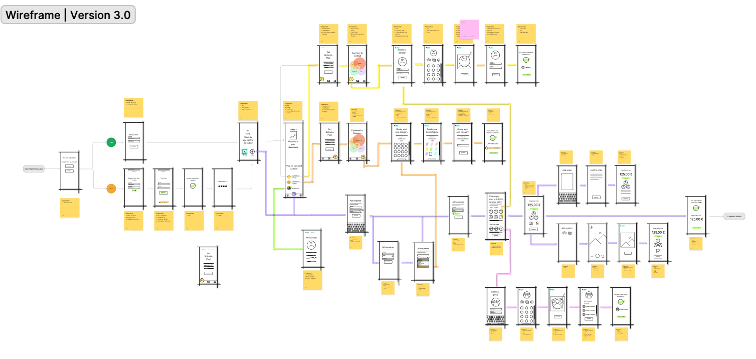
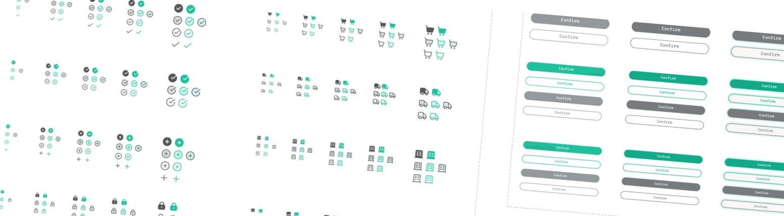
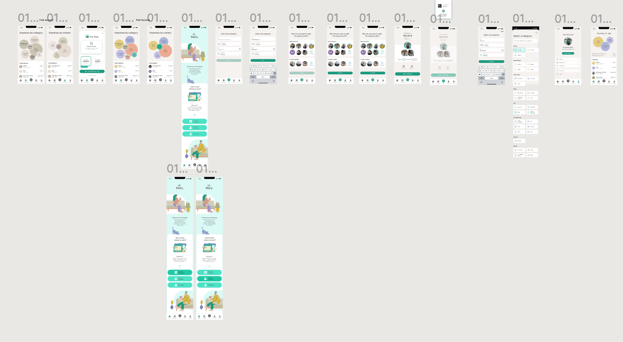
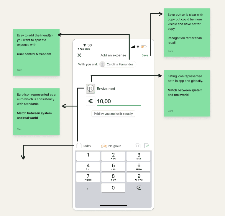
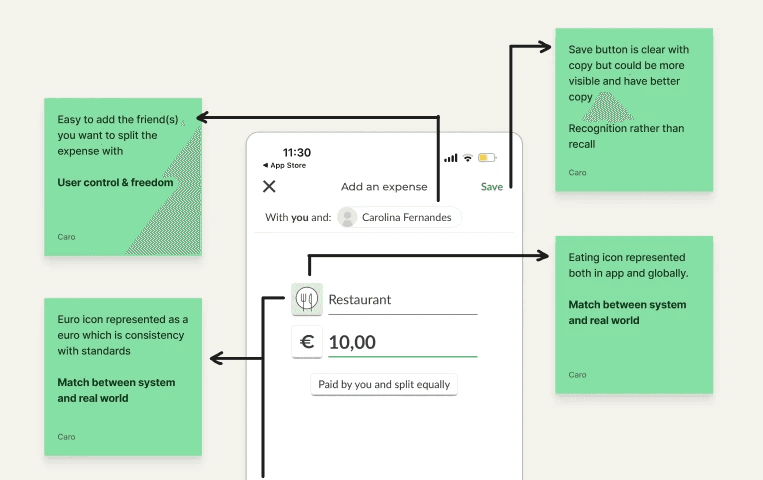
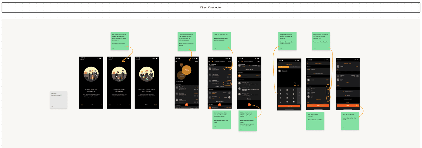
Sprinkle some design magic to make that user interface pop! Give the main "Save" button a spotlight, like it's the star of the show.

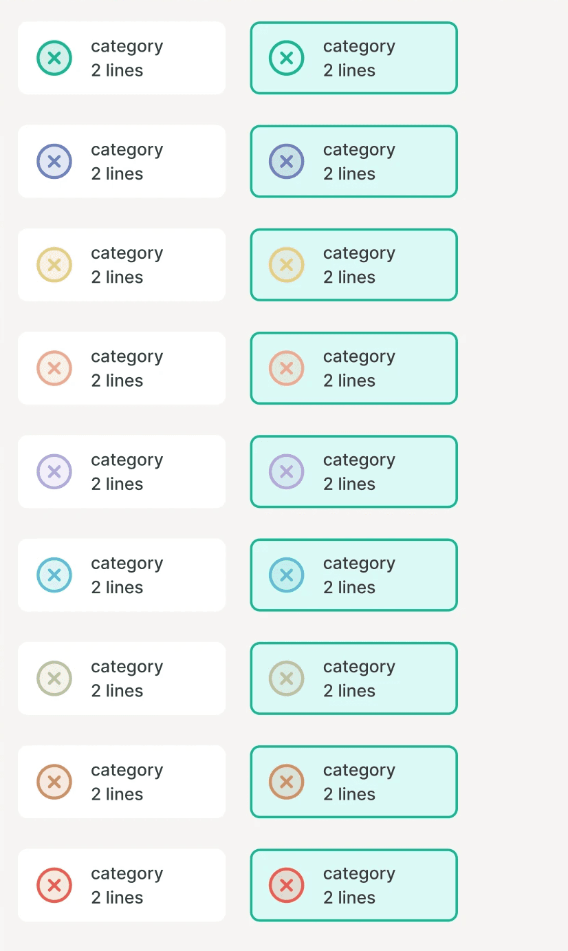
Let's get fancy with our categories! Add some pizzazz to the categorization options, making it easier than ever to pick the perfect category for your expenses.

When adding expenses, keep it simple, like a breeze on a summer day. Think "recurring expenses" or just a dash of the total amount – easy peasy!

Make those cool features stand out like celebrities on the red carpet! Give the photo function, notes function, and expense graphs their moment in the sun.

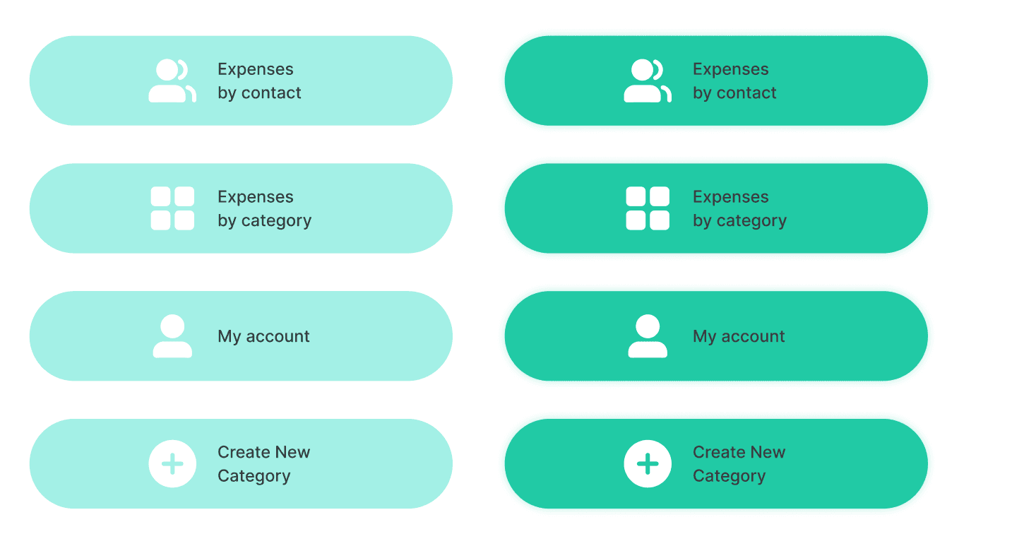
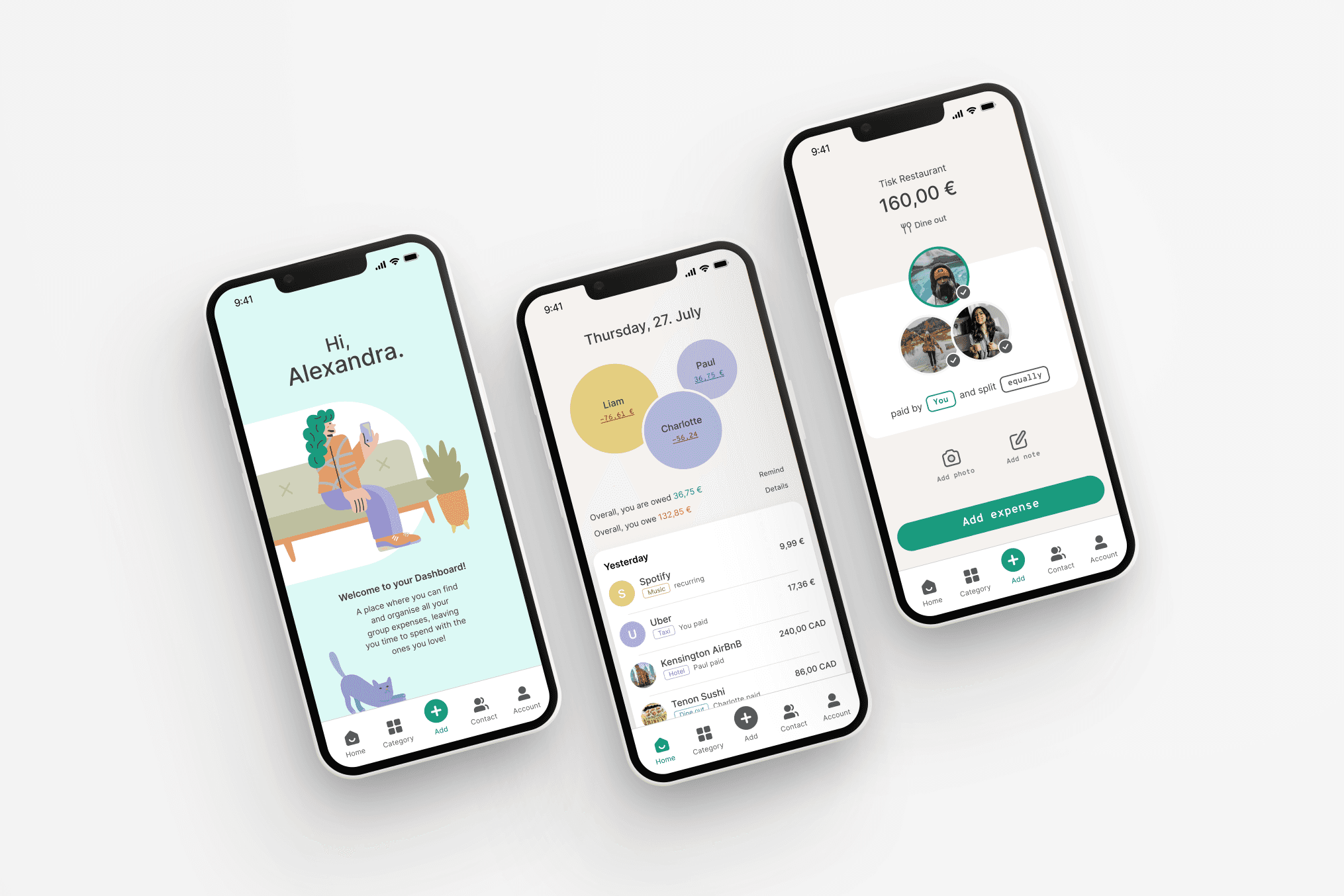
Navigate like a pro! We're talking a one-way ticket to the dashboard, no complicated detours. Keep it easy-breezy for all our users.


What can we add to the mix?

What can we add to the mix?

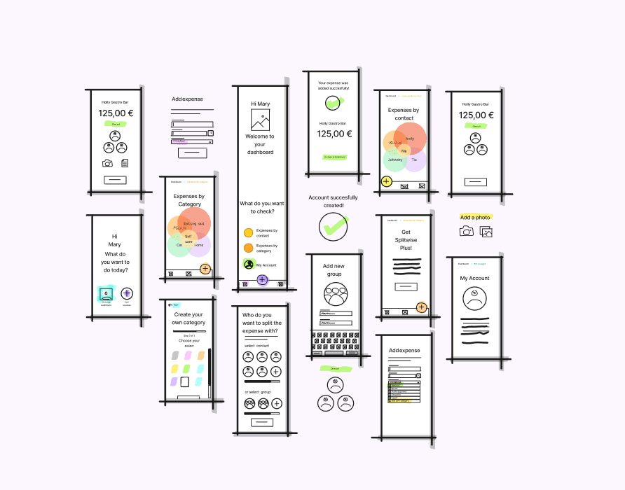
Get Creative with Categories: Now you can jazz up your expenses by crafting your very own category! Pick colors, sprinkle icons, and even bring back the "last category used" for that perfect personal touch!

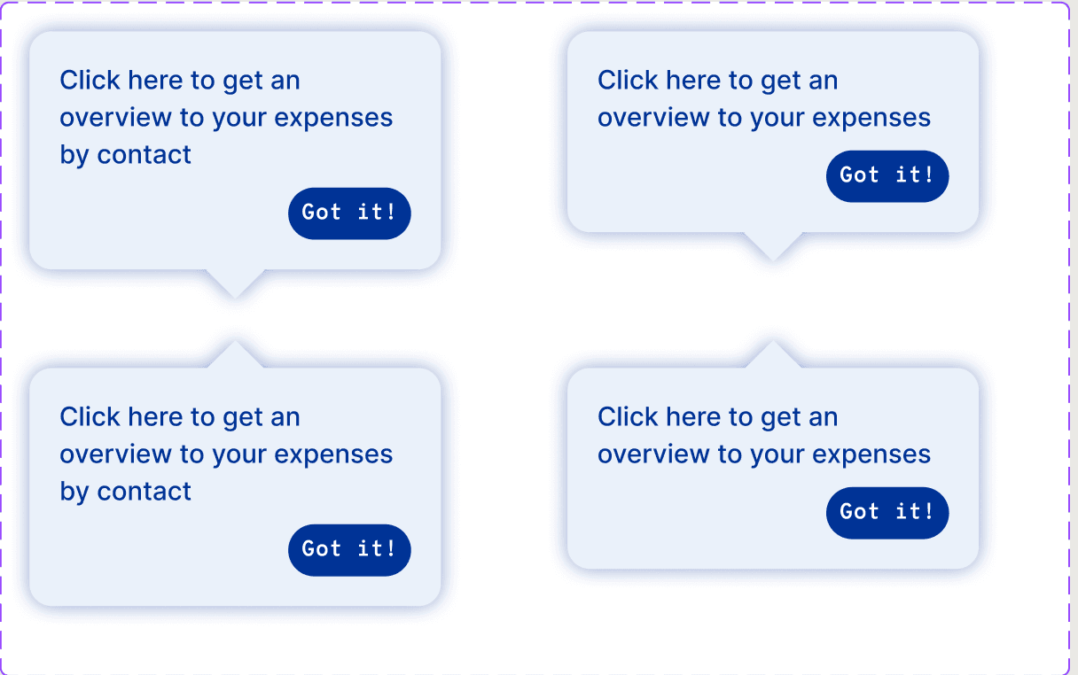
Welcome Aboard!: We've got a fancy onboarding process that'll make you feel like a pro in no time. It's like having a friendly tour guide showing you around the app and whispering sweet suggestions in your ear, like "Hey, how about adding a shared expense?"

Expense Eye-Candy: Behold the magical visual overview! It's like a scrapbook of your expenses. You can tag each one with the right person or group, making it feel like you're organizing a photo album with your BFFs.

Expense Entry Upgrade: Adding expenses has never been this snazzy. We've thrown in some nifty extras like the ability to set up recurring expenses (because we know bills have a habit of repeating) and a calculator for those tricky math moments.

User Flows: Charting Pathways to Bliss

User Flows: Charting Pathways to Bliss

User Flows: Charting Pathways to Bliss

The User Flow Diagram was like our treasure map, helping us uncover the secret steps users take to sprinkle a little magic on their outputs. To give you a sneak peek into our wireframe wonderland, we conjured up a user flow diagram for the existing app, and then, for an extra dose of pizzazz, we whipped up a new version, infused with all the brilliant ideas that sprang forth during our brainstorming bonanza!

The User Flow Diagram was like our treasure map, helping us uncover the secret steps users take to sprinkle a little magic on their outputs. To give you a sneak peek into our wireframe wonderland, we conjured up a user flow diagram for the existing app, and then, for an extra dose of pizzazz, we whipped up a new version, infused with all the brilliant ideas that sprang forth during our brainstorming bonanza!

Business & User Frustrations

Prototyping: A Journey to Perfect Function

Prototyping: A Journey to Perfect Function

Prototyping: A Journey to Perfect Function

Sketching on steroids is the best way to turn our thoughts into visuals - or, as the industry calls it, Wireframing!

We focused on wireframing our way through, before commiting to a solution - the goal was to fail fast and early,by catching any design flaws early on., and to identify exactly what screens we were missing and how we could improve thye user experience overall. This allowed us to focus on User-centered design, testing our ideas with real users, gathering their feedback and making improvements on the go.
It also allowed us to focus on structure,which is fundamental if we don't want to lose ourselves in a spiral of UI details, at this stage.

Business & User Frustrations
Competitor Benchmarking
Problem Space
Problem Space
Business & User Frustrations

We Never Fall Out Of Style… Guides!

We Never Fall Out Of Style… Guides!

We Never Fall Out Of Style… Guides!

To jazz up our design game and make it fun and accessible, we kicked things off by laying down some style rules for our trusty components. First up, we set the stage with a slick 4-column grid, and guess what? It plays by the 4-pixel rule, keeping things pixel-perfect.

Then, we splashed a bit of pizzazz onto our primary color by tossing in some groovy shades. And just for kicks, we threw in a snazzy light brown as our backup dancer, our secondary color. When it came to text, we went all neutral, keeping things calm and collected.

But wait, there's more! To keep our expenses and categories looking sharp, we added a handful of extra colors and dubbed them our "supplementary color palette." Think of them as the fancy bow ties on our design tuxedo.

Now, for the fonts – we didn't stop at just one. We introduced "Inter" as our main act, but to add a little personality without getting too messy, we brought in "Overpass Mono." It's got that cool contrast and a hint of uniqueness while keeping things spick and span.

And let's not forget the star performers – our standard components like buttons and cards, plus a snazzy icon library that came in handy when we were sorting things out. It's all part of the design party!

Review Snapshot
Review Snapshot
Business & User Frustrations
Competitor Benchmarking
Problem Space
Problem Space

High Fidelity Prototype

High Fidelity Prototype

High Fidelity Prototype

Behold the High Fidelity Prototype: Splitwise's Epic Triumph! This dazzling prototype is like the superhero version of Splitwise, showing off its mind-blowing powers and unforgettable tricks!
We focused on maintaining what makes Splitwise popular, but worked ont he main elements we identified that could use improvement - we went through quite a bit of iteration in high fidelity mockups and prototypes, reaching the end result you saw right at the start of the project.
By focusing on having a cohesive Dashboard, it made new users feel more at ease and increased the overall satisfaction when introduced to the app.

Review Snapshot
Review Snapshot
Business & User Frustrations
Competitor Benchmarking

Usability Testing: A Trial by Fire

Usability Testing: A Trial by Fire

Usability Testing: A Trial by Fire

The prototype was forged in the fires of rigorous usability testing. A compelling script and testing plan transformed Splitwise into a paragon of accessibility and charm. Behold an image that catalogs our relentless pursuit of excellence.
We focused on composing the usability script - including non leading questions and a good mix of segmentation questions & open ended questions.

Test Outcomes: Molding Masterpieces

Test Outcomes: Molding a Masterpiece

Test Outcomes: Molding Masterpieces

Having tested the prototype, we discovered precious gems of knowledge that will further elevate Splitwise, fueling business growth and user satisfaction.
We used Userberry to conduct these unmoderated user Tests, and were quite happy with the test results we got.

Having tested the prototype, we discovered precious gems of knowledge that will further elevate Splitwise, fueling business growth and user satisfaction.
We used Userberry to conduct these unmoderated user Tests, and were quite happy with the test results we got.

Three Key Learnings

Three Key Learnings

Three Key Learnings

In our bold expedition, we gleaned a treasure trove of insights.

In our bold expedition, we gleaned a treasure trove of insights.

💎💎💎

Listening Leads to Learning

Listening Leads to Learning

Listening Leads to Learning

1

1

Embrace the Unexpected

Embrace the Unexpected

Embrace the Unexpected

2

2

Collaboration Breeds Success

Collaboration Breeds Success

Collaboration Breeds Success

3

3


© 2023 The Splitwise Chronicles. All rights reserved.

© 2023 The Splitwise Chronicles. All rights reserved.